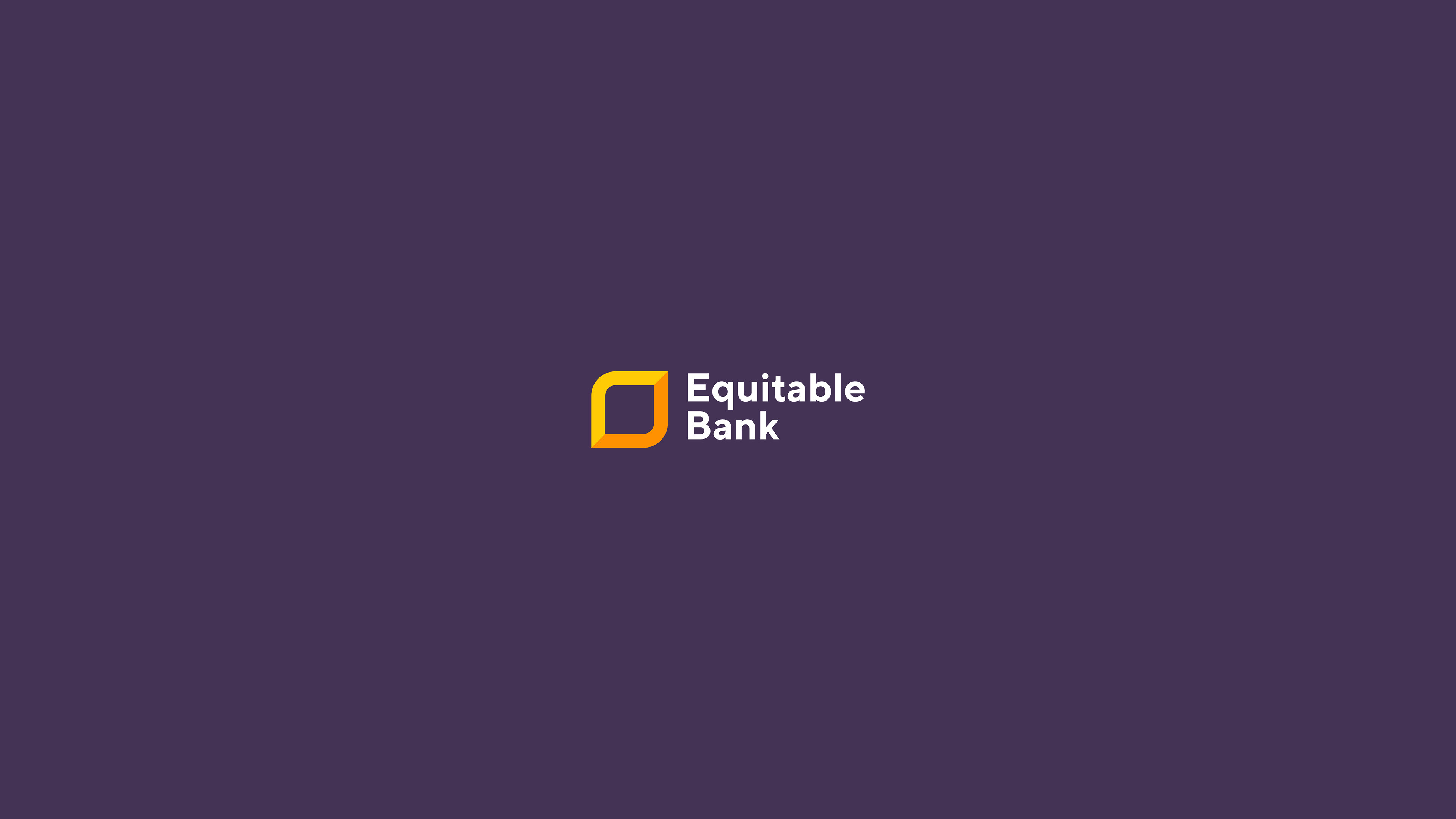
Equitable Bank (EQB) was founded in 1970 as The Equitable Trust Company and has become Canada’s ninth largest Schedule I bank. Equitable Bank offers a diverse suite of residential lending, commercial lending, and savings solutions, including high-interest savings products and GICs.
Since the early 90's, EQB has not had a rebrand of its visual identity. In their recent years, EQB has grown significantly. In 2013, EQB converted from a Trust Company to a Bank and 2.5 years later, it's digital banking platform, EQ Bank was launched. The structure of the company had grown at such great pace. The only thing left was the rebranding of the company.
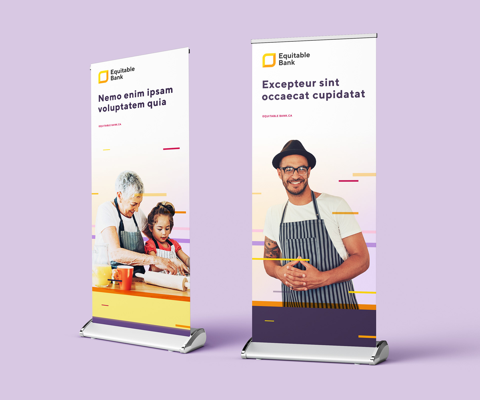
New, yet trustworthy
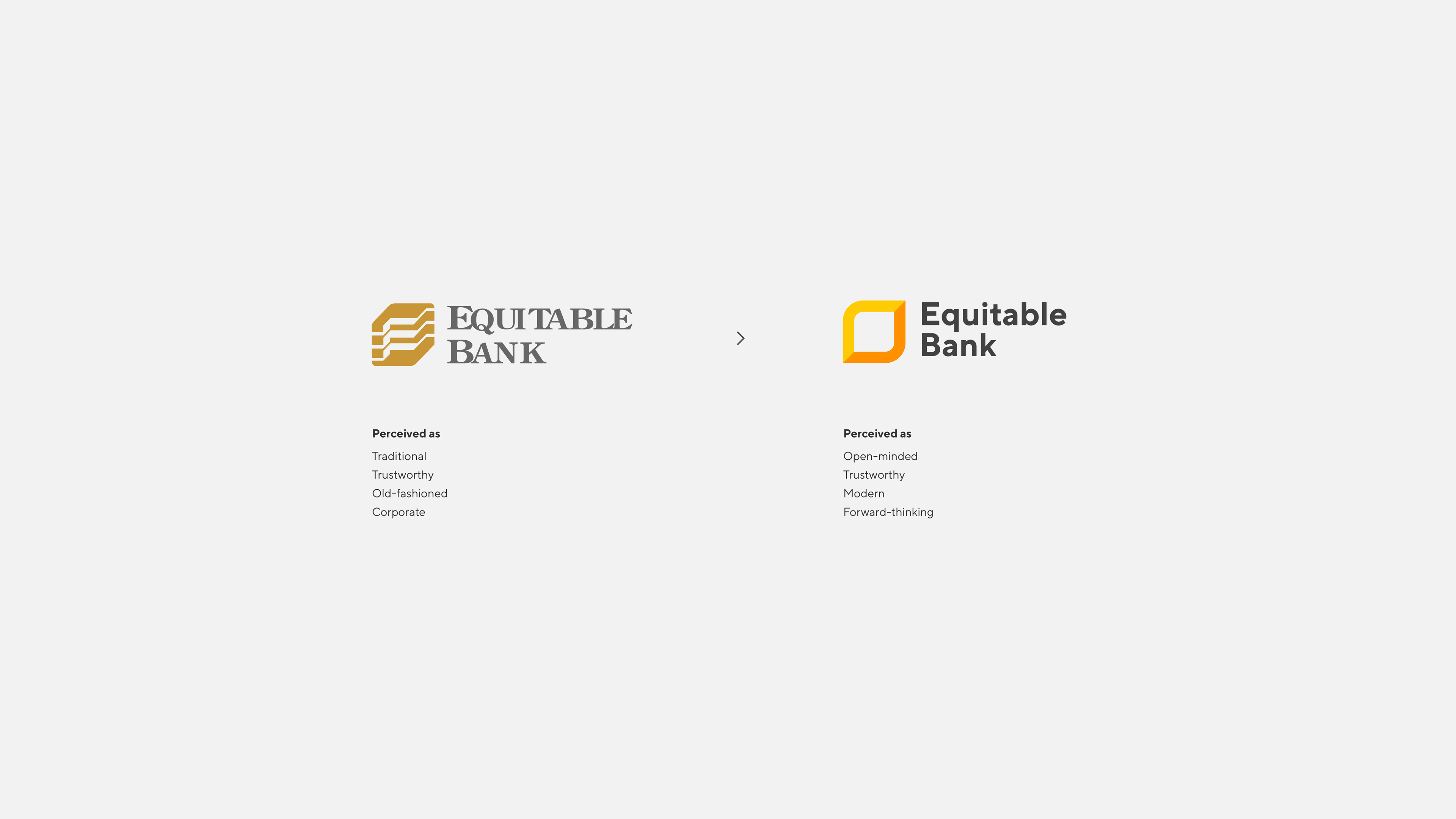
Research was conducted to reveal the impression people had of the company logo and the entire company as a whole. While people felt that the company as a whole was rather forward-thinking,they found the logo and aspects of the visual identity to be aged and out-dated. Thus, moving forward, we focused on modernizing the visual identity while keeping the aspect of "trust" that the aged logo entailed. We focused on the fact that EQB, compared to its main competitor can be viewed as more transparent in their processes thus, more trustworthy. At the same time, the old logo did not feel welcoming. The sharp straight edges made it look more like a tech company than a friendly bank.
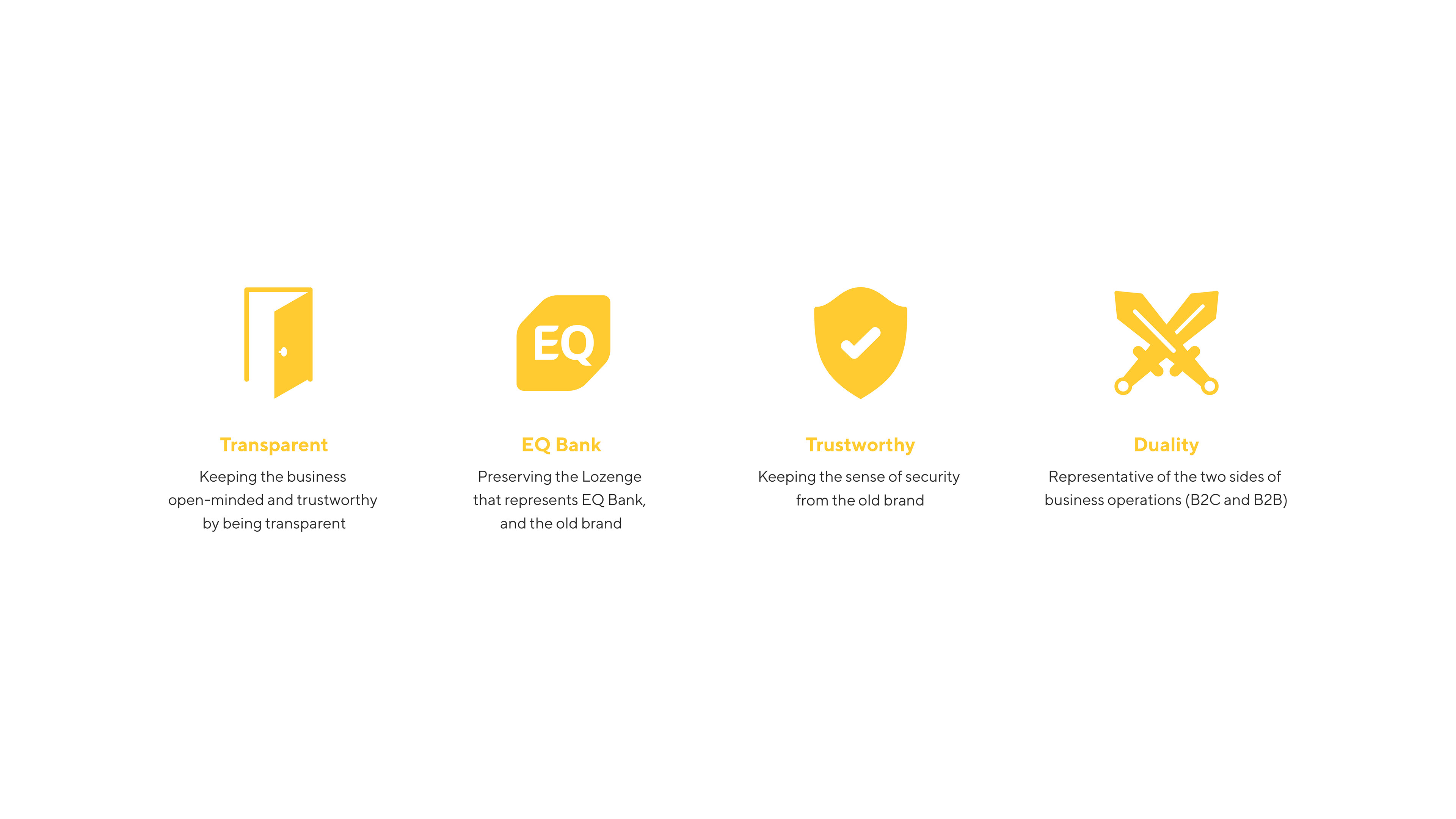
Since its digital banking platform, EQ Bank had recently used a logo that utilized the shape of the lozenge, EQB was looking to some how preserve the shape visually. The short-form 'EQB' is commonly used in the industry to refer to Equitable Bank, therefore, the option to incorporate this into the logo was also explored.